Does the fashion intelligentsia’s emphatic embrace of the camel coat every fall leave you head-scratching? Let me guide you through the world of beige.
Cold days are here and warm hues are in, everything cries for warm colors, your visual receptors included. This is exactly why a soft beige camel coat will keep its ‘staple’ status. Pick up Nina Garcia’s “The One Hundred: A Guide to the Pieces Every Stylish Woman Must Own” and the camel coat is there. Scan through the top-tier style blogs; the bottom line is that a camel coat is an absolute investment piece.
It’s perplexing for many women that what’s considered classic in fact leaves them looking jaundiced. If it’s perplexing for you, it means you have strong pink undertones in your skin. Welcome to the club. I too kept trying on numerous beige coats as well as throwing my husband’s camel blazers nonchalantly over my shoulders and, inevitably I stepped away from the mirror feeling defeated and wronged. What lights up his hazelnut skin tone turns me into an Edvard Munch’s “Scream.” My skin is neither olive nor peachy nor alabaster, it is some undefined color that combines pink and beige, a sprinkle of bleak freckles and occasional redness. Overall, it looks more on the warm side, but when you deal with complexion, there is more than meets the eye.
You need to meet your undertone, which is notorious for its reclusiveness. Undertones keep anonymity for the majority of their owners, stylists, and makeup artists. They tend to act like that neighbor you only get to see from the back on rare occasions you two happen to return home at the same time. He avoids eye contact and seems to purposefully rule out any possibility of a friendly chitchat. One needs to come up with a plot to meet your secretive neighbor aka your skin undertone. I did. It is pink. Pink undertone isn’t a caucasian prerogative. It can be found in black and Asian skin tones alike. It’s a certain quality of the skin that sabotages your relationship with yellow-based colors. And it’s the reason why you can’t sport those warm, cozy camels and beiges and why you are left at the outskirts of the allegedly timeless style. Perhaps a thorough foundation and some sculpting techniques could help, but the whole point of a camel coat is its casual appeal. A great camel coat is something you should be able to just throw on top of anything and feel great without being subjected to a world-class makeup.
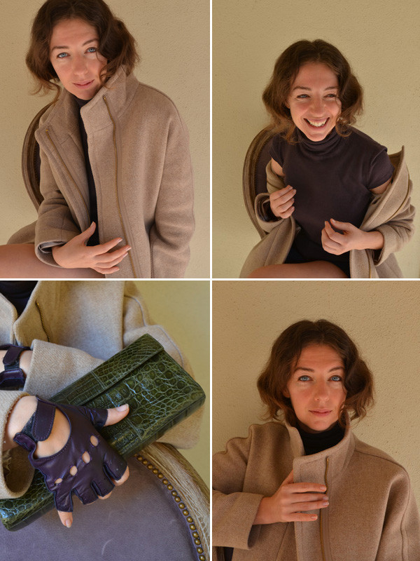
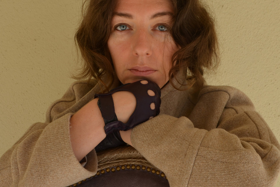
That is exactly the task all beige coats failed to perform for me until last year when I once again revisited the beige, this time at J.Crew. And much to my surprise their stadium cloth cocoon coat in “sandstone” suddenly worked. I finally saw that timeless appeal along with high ROI and makeup-free potential. Another thing about this coat is its crêpe-like fabric with rich, irregular weave. It goes a long way for complex skin tones that combine multiple colors as opposed to even olive and alabaster complexions, which are less demanding of fabric textures. This sort of texture elevates our wake-up-like-this looks. Here I am nearly makeup-free, save for my Benefit eyebrow wax that I also lightly applied as an eye pencil.
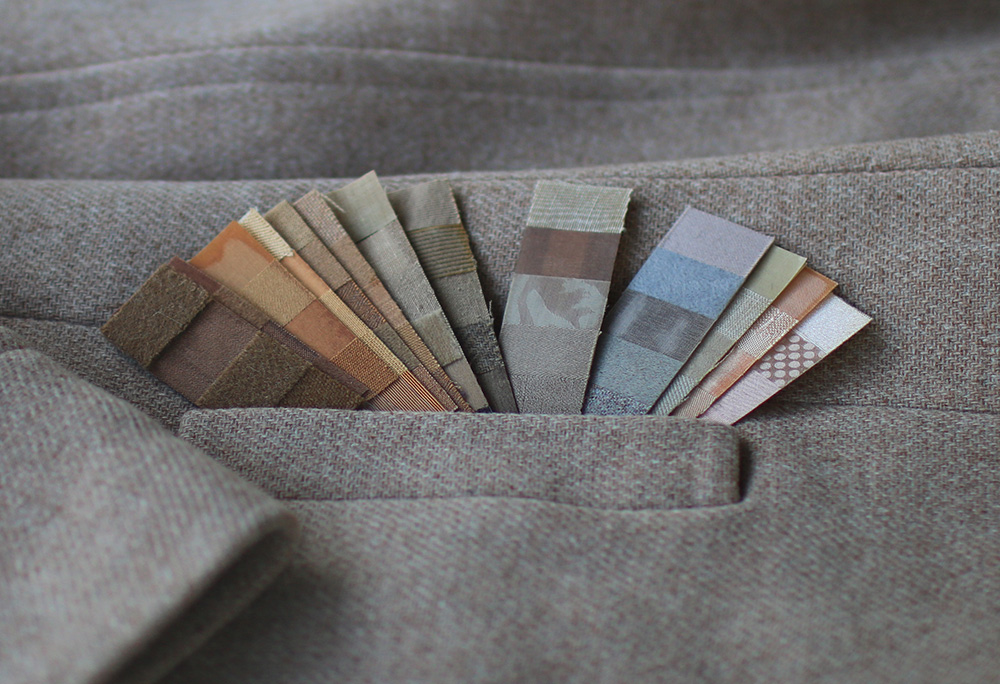
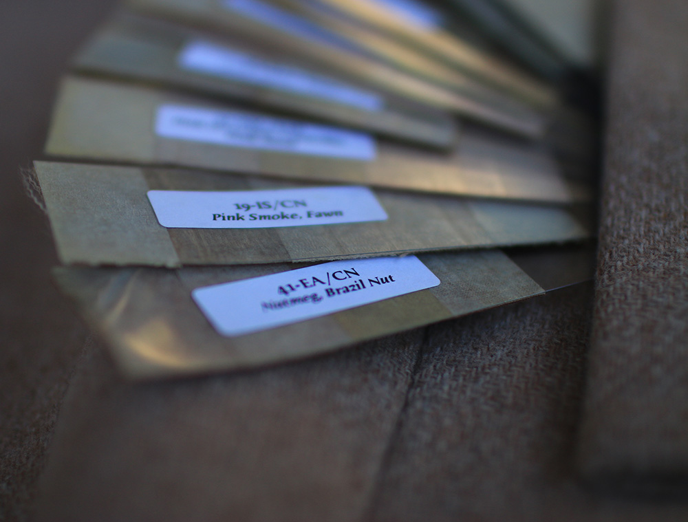
Being the hue junkie that I am, I whipped out all my camel-like fabric color swatches out and put them against the coat. They range from rich, sumptuous classical ochres to more grayed, watered-down beiges. The first ones (on the left) have labels like “burnt sugar,” “toasted almond,” “Brazilian nut” and “pumpkin spice” attached to them.

Along with their earthy names, the colors remind the hues of the Chauvet-Pont-d’Arc cave paintings. No wonder pink undertone rebels against the Paleolithic Chauvet ochre shades. Come to think of it, pink-undertone humans mustn’t have had much chance in caves. Were they even around at the time? Imagination offers pink-undertone species evolving upon the glass being adopted for domestic use, prompting people to spend more time indoors. If my frivolous speculation is at all correct, then you would think it’s over. Pink ochre is an oxymoron. But, the XXI century is all about juxtaposition and the world of color is miraculously complex, so everything is possible. As the swatches in my collection travel from heavily yellow-based to green, then grey-based and all the way to translucent pastels, we get to hues more inhibited in both saturation and name. This is where among “mushroom mist” and “twilight taupe,” I meet the swatch that matches with the J.Crew’s “sand stone.” It is called “pink smoke” and “fawn.” Sure enough it has pink smartly blended in.

One thing the concept of ‘Seasonal Harmony’ taught me is to be attuned to color names. It’s been decades since the concept fell out of favor, but I feel that in the age of Internet shopping color descriptions are carrying new responsibilities. What does a name like “light brown” or “tan” give a shopper struggling with a decision over a garment online? Now compare that to “candied ginger” and “brandied melon” teeming with spicy, ornate sensations delivered to you through that meddling screen. However wonderfully idiosyncratic and savory, they failed my pink undertone over and over, so I’d pass on them, saving everyone the returned merchandise costs, and move on, hoping for a more promising name. The truth is that while “pink smoke” is relatively straightforward, “fawn” is a bit more open to interpretation. But with all subjectivity, eloquent color names carry an enormous potential to convey valuable information to shoppers. J.Crew chose “sandstone” for their stadium coat. It’s not as breezy as “pink smoke,” but at least it hints of a more neutral shade, parted from the raw energy of “Brazilian nut.” “Sandstone” had equal chance of being refined or stark (which it might well be for someone with hazelnut skin tone). I gave it a try and was rewarded. This coat turned out to be both, tastefully understated and pink-undertone-friendly, finally giving me my beige-coat-sans-makeup-moment.


Bless you for this immensely worthy piece of advise for anyone with “pinkish” skin. You never fail to describe precisely the tiny and mighty rules of mastering the sartorial skills. And, you’re oh so right about thoughtful color names. I’ve been reading some vintage magazines and wondering where are those meticulous, careful, imagination-waking color names gone. Same goes for the fabric descriptions. Isn’t it wonderful how this attention to detail makes a two-lines caption under the (often black&white!) photographs in the old Vogue sound like a poetry today. “The palest swirl of seafoam – a blue delicacy, left, in soft wool baketweave that makes a dress with tiny cap sleeves, a draped panel buttoned very low at the back…”
Apparently, now I also need to read each of your stories twice, in both English and Russian; but damn, it’s hell of a pleasure too!
All these months I have been thinking of one of your previous comments from 2-3 years ago when you expressed your high hopes for my projects (you left it in the entry about Ulyana Sergeenko). That comments of yours motivates me immensely. I will not let you down. ;)
That’s so lovely!.. Gosh, I am still head over heels for Ulyana and save her pics (the collection of visual inspirations is already way too large, as is the amount of time I think about style, being a sofware engineer), still praise your articles and have a strong thrilling anticipation of the mission both of you carry out so elegantly.
On a side note, it’d be nice to be notified of your replies by email :)
In order to get notifications about my responses you would need to set up an account on WordPress.. a bit of a fuss, but no other options as of right now.
So nice article you made!
Would you please advice which size of this coat you bought ? Coat sholders compliments yours in are very gracefull manner. Adding a bit of sport touch.
I have 8.
Wow! Woundering why your coat size is sooo big! Which size you are in tailored appmarket brands, like vince, theory ? Jcrew usually one size bigger than theory, for example. and this cocooncoat roomy enought to wrap your subtle shoulders even in size 6! How wide it is in your hips ? this details matters and it will be nice to know while deciding for mine yet another cocoon for this season. My recent MM Weekend Urna coat in UK10, US8 but this is true US , like Theory, and it is equal to Jcrew US6.
Mmmm.. I am pretty generous in hips. ;), The coat is not super wide in hips, just enough to wrap it all in a nice silhouette. I have pics in Instagram in it. The cocoon cut makes it all possible, I can’t sport the same oversize effect in coats that are not tapered at the hem. Looks ‘babushka’. I haven’t tried Theory or Vince, they are ‘not my stuff’ , though I love Vince vicariously on others. All in all, my size repertoire varies from the US size 2 to 10..
Natasha, you look so beautiful in these pictures.