In this entry I want to show you how two different women with yellow undertones in their complexion can take two different style and color routes.
Please note that none of them are wearing serious photoshoot makeup and you are seeing casual shots.
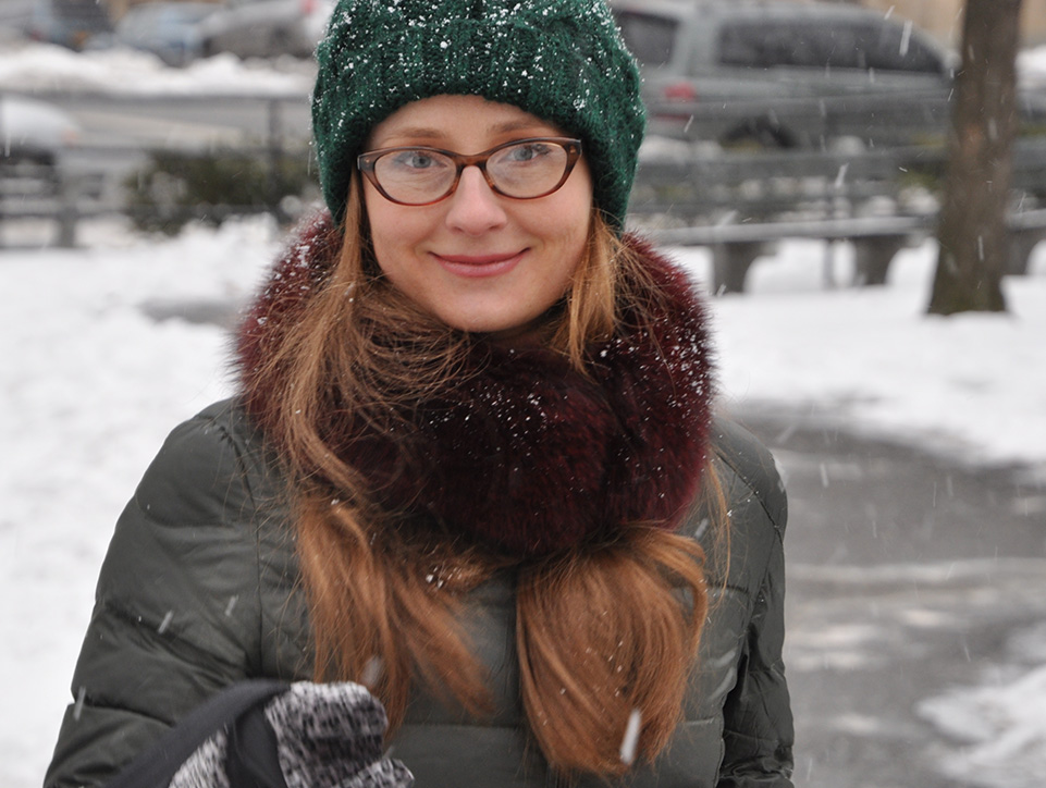
Please meet my friend Lena, who is a red head with freckles generously spilled all over her face. The first urge is to outfit her in similarly fierce, flamboyant colors as her own. But the moment you start throwing in those spicy reds, butternuts and toasted browns you will start seeing Lena gradually fading and her luxurious red mane turning washed out and dull..
This is the result of the strong pink undertone hiding under the thin layer of warm freckles. Do not let the facade of brandied freckles fool you, as it is only skin deep and there is more than meets the eye. This is the type of complex beauty that needs a pause and a more thoughtful approach than the assembly line styling.
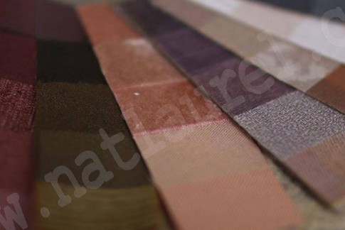
I take a couple of warm, toasted hues like Maple Red and Oriental Bronze and start surrounding them with dusty mauves and teals that range from cool to neutral. The final palette will resemble a sunset with flames that dies into the dark purples and slate blues of the sky, forming a series of breathtaking ombres.
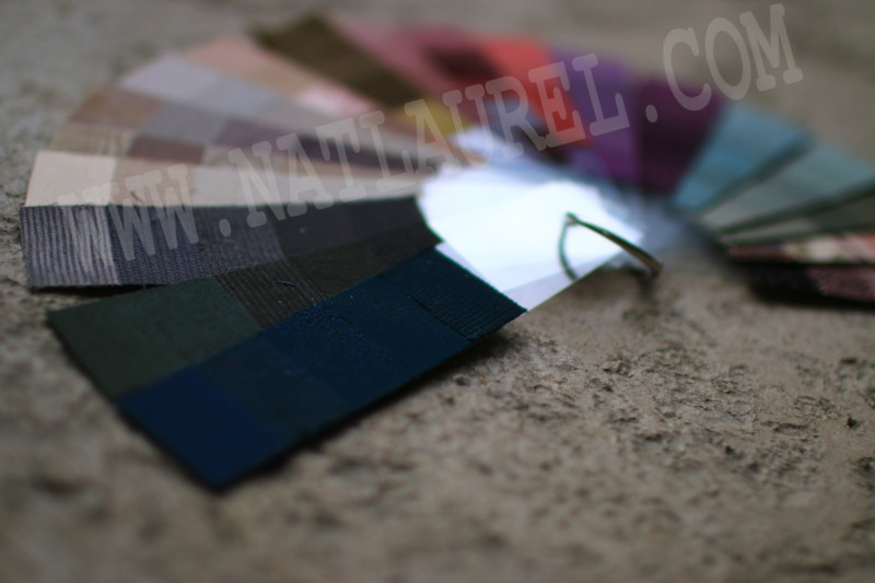
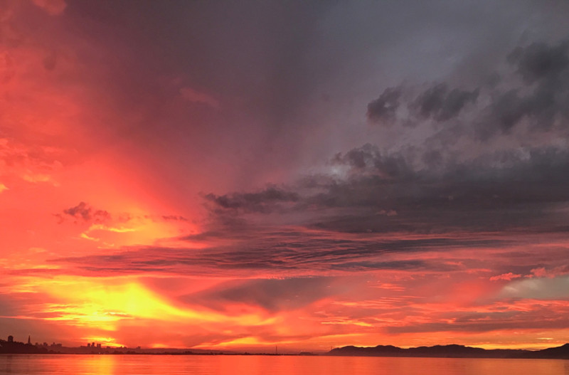
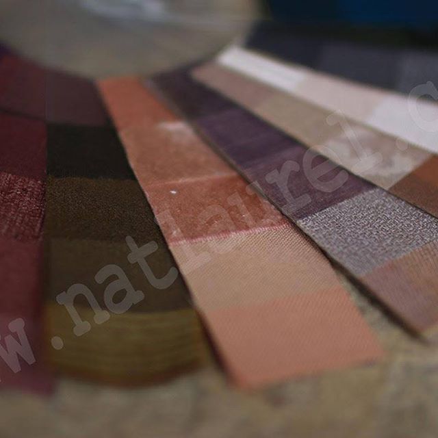
The soft gradients will support both, the warm and the cool undertones of her complexion. But what is even more important, the ombre quality of color combinations will complement the fineness of Lena’s facial bone structure. This is what contributes to her Renaissance S-type beauty type.
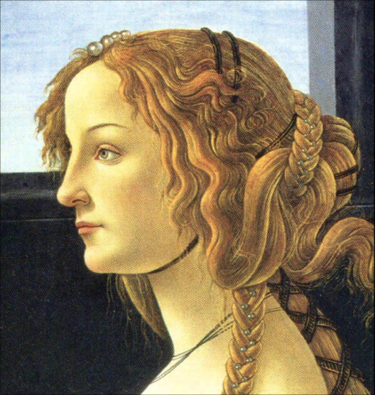
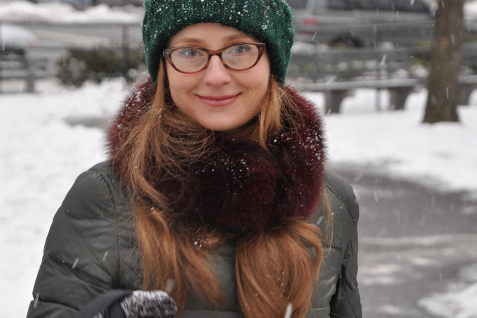
Now, here comes Katya. Despite the warm skin undertones she shares with Lena, her beauty is is in striking contrast to Lena’s. This is what I call a Z-type, Paleo beauty type. Her Amazon face requires zero fuss hairstyling. Please note Katya is also wearing zero makeup as she came to my place unprepared for a photoshoot. I snapped her as she was trying on clothes that I picked for her, and she kindly agreed to have her shots posted here.
Hers is the facial bone structure that has been staring at you from all the cutting edge Vogue-level online catalogs like InterMix, Farfetch, Net-a-Porter. This type of beauty has been pioneered by the legendary Vogue editor of the 1960s, Diane Vreeland. It was further supported by her successors, Grace Mirabella and Anna Wintour. It took three Vogue editors for this strong boned beauty to make it to the front lines.
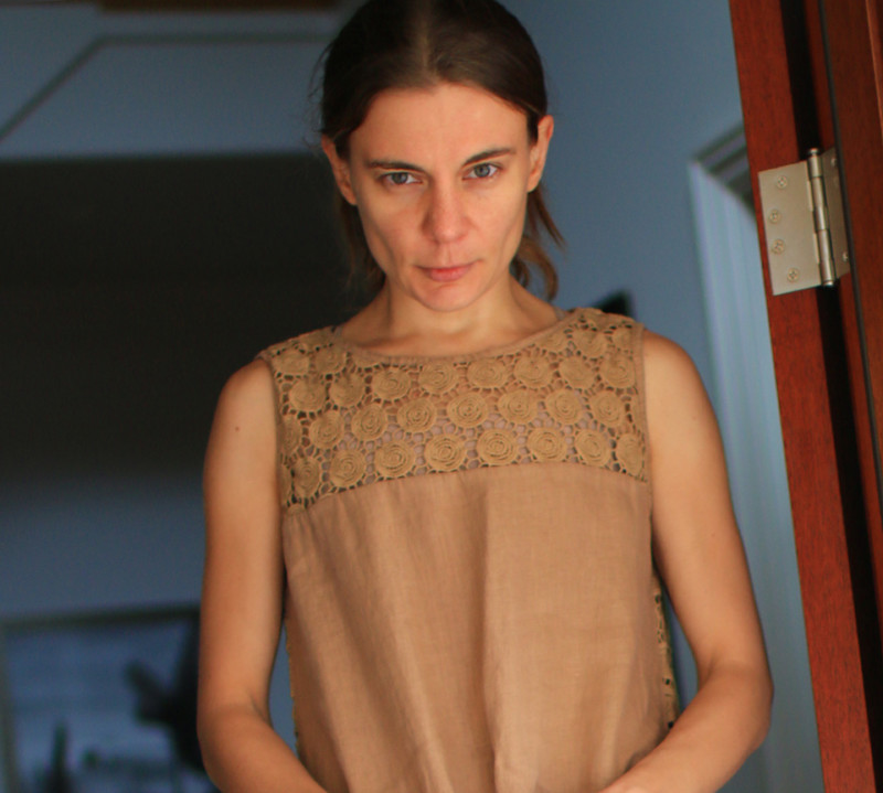
Katya’s warm complexion has no pink undertones to it. It feels deeply caramelized all the way to the bone. You will have to take my word for it, because there is no way you can read the undertone off the picture. What you can read off the picture though is how much her facial bone structure: the wide bridge of the nose, the straight line of her eye brows and a very pronounced zygomatic arch contribute to resemblance of a lioness.
These are all the fundamental things that your stylist eye should be attuned to.
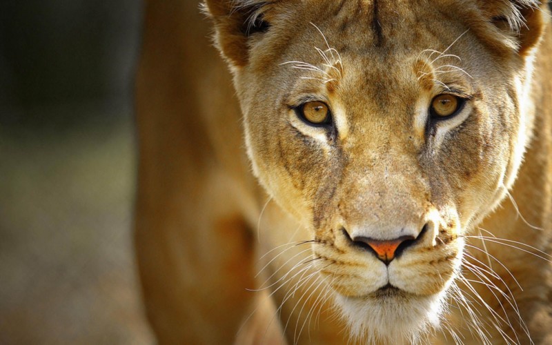
picture source www.fuzzyundertones.
Where Lena benefits from playing up her resemblance with the classic goddesses of the Renaissance paintings, Katya is winning building up on her animal magnetism. This is when earthy colors come into play. Bring in all the ochres, blend them into greens, toast those almonds, and don’t be shy on cardamon.
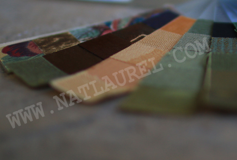
The Oriental bronze she shares with Lena gets a different company. Instead of carefully selected reserved purples and mauves of the dusk, Katya’s Green Bronze joins the warmth of other feline greens and ochres forming a much more tactile aesthetic, not the breezy feeling of the skies.
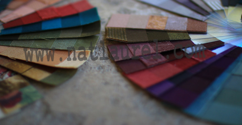
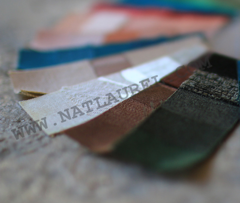
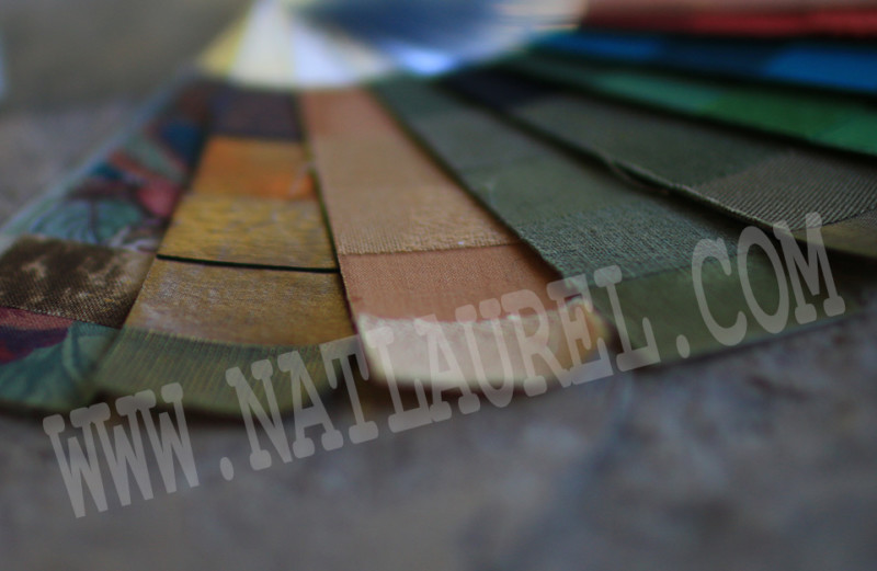
For assembling personal color palettes I use Seasonal System developed by a California stylist, Susan Caygill (1911-1994). The featured palettes are Dusk Summer and Mellow Autumn based. Find our more about my work here.

→ Prev
Next →